

Set the Center at 57 Inches: Gallery Wall Layout for DIY Homeowners
Pick your anchor piece first, mock it up on the floor before you touch a hammer, then hang everything with the same 2 to 3 inch gap and the wall’s visual center at 57 inches high. That single sequence prevents almost every mistake people make. Start with the biggest or most striking piece, build outward from there, and adjust only after you’ve lived with the paper or floor version for a day or two.
TL;DR:
- Using a 2-3 inch consistent gap and positioning the overall layout at 57 inches height ensures a balanced and mistake-free gallery wall.
- For layouts, choose grid for order, organic for personality, horizontal for hallways, and staircase for following stairs, aligning with each space’s function.
- Measure total width starting from the visual center, aiming for two-thirds to three-quarters of furniture width, and add framing and gap measurements for precise sizing.
- Start by hanging the largest or most striking piece, build outward with a consistent size and spacing, and verify with floor mock-ups or kraft-paper templates before drilling.
- Fix common mistakes by enforcing uniform gaps, defining outer boundaries, and accurately measuring hook offsets to prevent crooked frames and uneven spacing.
Table of Contents
- What Is the Best Gallery Wall Layout: Grid, Organic, or Staircase?
- How Do I Measure and Calculate the Gallery Footprint Before I Hang Anything?
- How Do I Choose and Arrange Pieces So the Wall Reads as One Composition?
- How Do I Mock Up Layouts Before I Drill Holes?
- What Spacing and Visual-Weight Rules Keep the Arrangement Balanced?
- What Is the Step-by-Step Hanging Sequence to Get a Pro Result?
- How Should I Adapt the Method for Staircases, High Ceilings, or Above Furniture?
- What Are the Most Common Gallery Wall Mistakes and Quick Fixes?
- What Tools and Products Speed Planning and Give You Swap-Friendly Displays?
- How Do I Curate a Themed Gallery Wall for a Dark or Gothic Aesthetic?
- What Does an Editor’s Checklist Look Like for Getting This Right the First Time?
- Where Can You Find Curated Pieces to Complete a Themed Gallery Wall?
- Sources
- FAQ
What Is the Best Gallery Wall Layout: Grid, Organic, or Staircase?
Four layout types cover almost every wall you’ll face, and picking the wrong one for your space is the fastest way to end up frustrated with a wall you spent a whole Saturday on.
A grid layout uses matching or near-matching frame sizes in even rows and columns. It reads as calm and formal, making it the right call for a dining room or a home office where you want order, not chaos. Center the grid on the wall or above your furniture and keep every gap identical.
An organic layout (also called a salon or eclectic layout) mixes frame sizes, orientations, and sometimes media, arranged in a loose cluster rather than rows. It suits a living room, entry, or reading nook where you want personality over precision. Start with an anchor piece placed slightly off center, then build outward in a rough oval or rectangle.
A horizontal layout stretches a single row of frames along a hallway or above a long console or headboard. Keep every piece’s centerline aligned rather than the tops or bottoms.
A staircase layout follows the diagonal line of the stairs rather than a level baseline. This is the one layout where “keep it level” doesn’t apply; the whole point is following the rise.
- Above a sofa: organic or grid, centered on the furniture, not the wall
- Hallway: horizontal row, single centerline
- Stair run: staircase style, diagonal baseline stepped to match tread rise
- Narrow wall: vertical organic cluster, stacked rather than spread wide
Once you know which category fits your wall, everything downstream (spacing, sizing, hanging height) gets a lot easier to calculate.
How Do I Measure and Calculate the Gallery Footprint Before I Hang Anything?
Measure the wall or furniture width first, then work out your total display footprint using the 57-inch visual center rule, which puts the middle of your entire arrangement at average eye level. That’s the standard museums use, and it holds for standing viewing areas like hallways. In a room where people sit most of the time, like above a sofa, drop the center a few inches lower so it reads correctly from the couch.
Here’s how to size and calculate the layout step by step:
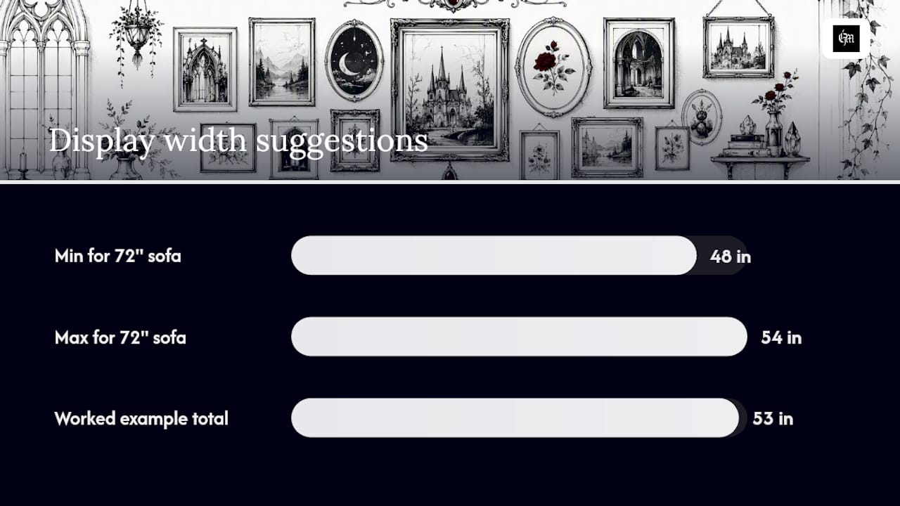
- Set your total width. If hanging above furniture, aim for two thirds to three quarters of that furniture’s width. A 72-inch sofa gets a display roughly 48 to 54 inches wide.
- Decide columns and rows based on your chosen layout type and frame count.
- Add up framed widths. Measure each frame’s outer edge, not just the artwork inside it.
- Add your gap (2 to 3 inches per side) between every column and row.
- Sum it all: total width = (sum of frame widths) + (gaps × number of spaces between frames).
A worked example: three frames at 16 inches wide each, with 2.5 inch gaps between them, gives you 48 inches of frame plus 5 inches of gaps, or 53 inches total. That fits neatly against a 72 inch sofa within the two thirds to three quarters range.
For a bare wall with no furniture reference, designers generally suggest the arrangement fill somewhere around half to two thirds of the available wall space so it doesn’t look stranded or cramped.
How Do I Choose and Arrange Pieces So the Wall Reads as One Composition?
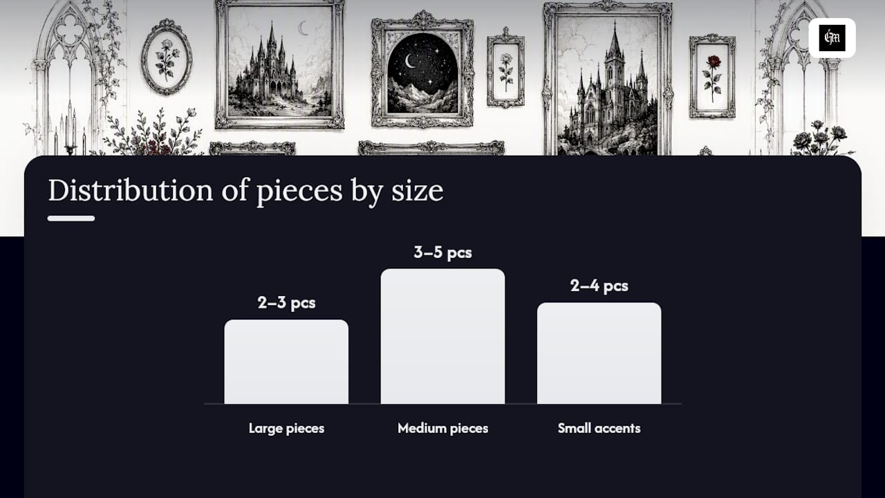
Pick one anchor piece that’s clearly the largest or most visually dominant item, then build everything else around it in a rough three-size distribution. A practical formula that works across most wall sizes: two to three large pieces, three to five medium pieces, and two to four small accent pieces, according to sizing guidance from Art Academi. That range keeps the eye moving without any single piece competing with your anchor.
Framing matters as much as size. Mixing frame styles is fine, and often more interesting than a matched set, but limit yourself to three finishes total (say, black, brushed brass, and natural wood) so the wall still reads as intentional. Mat color repetition does more for cohesion than matching frames ever will.
- Choose one anchor and treat every other piece as support for it
- Cap frame finishes at three across the entire arrangement
- Repeat a mat color or border width to tie mismatched frames together
- Add one or two three-dimensional or textured pieces for depth, not more
Pro Tip: If you’re mixing photography, prints, and a textured piece like a small mirror or wall sculpture, place the 3D element near the anchor rather than at the edges. It reads as intentional instead of tacked on.
How Do I Mock Up Layouts Before I Drill Holes?
Lay every frame out on the floor in your planned arrangement before a single nail goes into the wall. This is the step designers rely on most, and it’s the one people skip because it feels slow. It isn’t. It saves you from patching a dozen unnecessary holes later.
The floor method works like this: arrange frames on the floor in the shape you want, adjust spacing until it feels balanced, then photograph it from directly above so you have a reference to work from at the wall.
Kraft-paper templates take that one step further. Trace each frame onto butcher paper, cut it out, and tape the paper shapes directly to the wall in your planned layout. This lets you live with the arrangement for a few days before committing, and you can mark your nail position right on the paper, transfer the hook offset, then peel the paper away and hammer into that exact spot.
- Photograph the floor layout from above for a reference you can check against
- Cut kraft-paper templates sized to each frame’s outer edge
- Mark the hook position on the paper before you tape it up
- Use a printed life-size template or online layout generator if you want exact nail coordinates calculated for you
What Spacing and Visual-Weight Rules Keep the Arrangement Balanced?
Pick one gap distance, usually 2 to 3 inches, and hold it for every single space in the arrangement. Inconsistent spacing is the single most common thing that makes an otherwise good layout look off, and designers consistently point to a uniform gap as the fix.
Pro Tip: Cut a spacer card at your chosen gap width and use it as a physical ruler for every placement. It’s a five-minute prep step that keeps 20 frames perfectly consistent instead of eyeballing each one.
Beyond spacing, balance visual weight by distributing your large pieces diagonally across the arrangement rather than clustering them on one side. Keep darker or heavier-looking pieces toward the lower portion of the wall; it grounds the composition instead of making it feel top heavy. Repetition, not matching, creates cohesion: a consistent mat color or finish family will unify a mismatched set of frames far better than forcing every frame to match.
What Is the Step-by-Step Hanging Sequence to Get a Pro Result?
- Hang the anchor piece first, positioned at your calculated visual center (57 inches, adjusted for seated viewing if needed).
- Work outward from the anchor in both directions, checking your kraft-paper or floor reference as you go.
- Measure the hook offset on each frame (the distance from the hanging hook down to the frame’s top edge) and mark that offset on your template or directly on the wall.
- Use a level on every single frame and your spacer card between each one.
- Hang center-outward, not left-to-right, so any small adjustment at the end lands at the edges instead of throwing off your anchor.
- Step back and check the whole wall from across the room before calling it done; minor shifts are easier to fix now than after everything’s up.
This sequence is why designers rarely re-drill more than once or twice per wall. The anchor sets your reference point, and everything else measures off it.
How Should I Adapt the Method for Staircases, High Ceilings, or Above Furniture?
Staircases break the usual “keep everything level” rule. Instead, follow the diagonal baseline of the stairs and step each frame up by roughly the stair rise, typically 7 to 8 inches per step, aligning each frame’s center to its corresponding tread rather than a shared horizontal line.
Above furniture, keep total arrangement width at two thirds to three quarters of the furniture’s width, and hang the bottom frame edge 6 to 10 inches above the furniture’s top surface. Too much gap and the pieces float disconnected from the couch or console below them.
High ceilings tempt people to stretch the arrangement taller to fill the space, which usually backfires. Instead, either scale the whole composition up proportionally with larger pieces, or build a tighter vertical cluster that draws the eye upward without crowding the ceiling line. Leave breathing room above the top row.
- Staircase: diagonal baseline, frames stepped to match tread rise
- Above furniture: bottom edge 6 to 10 inches above furniture top
- High ceilings: scale up proportionally or cluster vertically, don’t just add height for its own sake
What Are the Most Common Gallery Wall Mistakes and Quick Fixes?
Most gallery wall problems trace back to three fixable issues, and none of them require starting over.
- Inconsistent spacing: if gaps vary frame to frame, the wall looks messy even with great art. Fix it by picking one spacer width and rehanging with that measurement enforced throughout.
- No clear outer boundary: an arrangement that trails off at the edges instead of forming a defined rectangle or shape reads as unfinished rather than curated. Define your outer edge first, then remove your lowest-value pieces if the boundary keeps drifting.
- Crooked frames: usually caused by hook offset errors, not a bad level. Re-measure the distance from hook to frame top on the offending piece and adjust the nail position by that exact amount rather than eyeballing a tilt fix.
What Tools and Products Speed Planning and Give You Swap-Friendly Displays?
Online layout generators calculate exact nail positions and let you preview scale before you buy a single frame, which is worth using if you’re working with more than six or seven pieces. Printed life-size templates do the same job with paper and a tape measure, no software required. Gallery kits (pre-matched frame sets sold as a bundle) remove the sizing math entirely but limit your creative control.
- Floating ledges let you lean and rearrange frames without any hardware commitment, ideal if you swap art seasonally
- Magnetic mounts or adhesive strips work well for lightweight pieces you plan to rotate often
- A printed template saves you from extra nail holes and mis-centered anchors, the two most common regrets after a first hang
- Command-style strips suit renters who need a damage-free option more than permanence
How Do I Curate a Themed Gallery Wall for a Dark or Gothic Aesthetic?
A themed wall lives or dies on repetition, not matching. Pick one palette (deep charcoal mats, aged brass frames, or matte black hardware) and repeat it across every piece, even when the art itself varies wildly in subject or medium.
- Mix flat 2D prints with shallow relief pieces like carved panels or small dimensional sculptures for texture
- Secure any three-dimensional collectible with proper mounting hardware rather than adhesive alone; see safe display methods for gothic collectibles for specifics
- Combine wood, metal, and canvas pieces using the wall art pairing guide to keep dark décor cohesive rather than cluttered
- Lean on a curator’s approach to dark aesthetic galleries if you’re starting from scratch with no existing collection
What Does an Editor’s Checklist Look Like for Getting This Right the First Time?
Every gallery wall that turns out well follows roughly the same short checklist: measure the wall and furniture, mock up the layout on the floor or with kraft paper, cut a life-size template if the arrangement is complex, hang the anchor first, and check every frame with a level before moving to the next.

None of that requires design training. It requires patience during the mockup stage, which is the part most people rush. Live with the paper template taped up for a day or two before you commit to nails. You’ll notice if something feels off while it’s still just paper, and that’s a five-minute fix instead of a wall full of patched holes. Swap pieces in and out over the following months; a gallery wall is never really finished, and that’s the point.
— Rey
Where Can You Find Curated Pieces to Complete a Themed Gallery Wall?
If your gallery wall needs pieces with real character instead of generic prints, Goth is a curated marketplace built around dark, occult, and alternative wall art, sourced from independent artists rather than mass-produced stock. A themed wall reads as collected, not decorated, when the individual pieces already carry a consistent mood, which is exactly what a curated source solves before you even start hanging. Browsing a marketplace built around one aesthetic saves you the scattered search across a dozen generic decor sites trying to find pieces that actually belong together. If your wall’s design also has to account for an adjacent doorway or entry point, this interior door design overview is worth a look before you finalize your layout boundaries. Start browsing the current wall art and dark decor collection to see what’s available before you finalize your frame count and sizing.
Sources
- Frameology – How to measure and plan a balanced gallery wall
- House Beautiful – How to style a gallery wall the right way
- Art Academi – How to plan a gallery wall
FAQ
What is the rule for gallery walls?
The core rule is anchor first, consistent spacing second: pick one dominant piece, build outward from it, and keep every gap between frames the same, typically 2 to 3 inches. Center the whole arrangement at roughly 57 inches from the floor for standing viewing areas.
Is there a specific way to arrange a gallery wall?
Yes. Start with your largest or most visually striking piece as the anchor, then distribute remaining pieces using a rough size mix of large, medium, and small so the eye has somewhere to rest. Mock the layout up on the floor or with kraft-paper templates before hanging anything.
Are gallery walls still popular in 2026?
Gallery walls remain a staple of home decor, though the style has shifted toward smaller, more curated arrangements and rotating ledge displays rather than the maximalist floor-to-ceiling salon walls that were common a few years ago. The core hanging rules haven’t changed, even as the scale has gotten more restrained.
What are common gallery wall mistakes?
The three most frequent mistakes are inconsistent spacing between frames, no clear outer boundary so the arrangement looks unfinished, and crooked frames caused by inaccurate hook-to-top measurements rather than a bad level. All three are fixable without rehanging the entire wall.
How high should a gallery wall be hung?
Center the overall arrangement at about 57 inches from the floor, which matches average eye level for standing viewers. In a room where people mostly sit, like above a sofa, lower that center a few inches so it reads correctly from seated height.
How much space should be between frames in a gallery wall?
Keep a consistent small gap between every frame, using the same measurement for every space in the arrangement to maintain visual harmony. A cardboard spacer cut to that exact width makes it easy to stay consistent across a dozen or more frames.
Should gallery wall frames match?
No. Mixing frame finishes is common and often more visually interesting than a matched set, but limit yourself to about three finishes total and repeat a mat color or border style across pieces to keep the mismatched frames feeling intentional rather than random.
How do I plan a gallery wall without making extra nail holes?
Mock up the arrangement on the floor first, then cut kraft-paper templates sized to each frame and tape them to the wall in your planned layout. Mark the hook position directly on the paper before transferring it to the wall, or use a printed life-size template or online layout generator for exact nail coordinates.