

Creating a Dark Aesthetic Gallery: A Curator's Guide
TL;DR:
- Creating a dark aesthetic gallery involves deliberate use of color, lighting, and layout to evoke mood and depth. Proper materials, lighting, and spacing are essential to achieve a cohesive and atmospheric space.
Creating a dark aesthetic gallery is the practice of deliberately curating color, light, and composition to transform a physical or digital space into an atmosphere of mood, depth, and artistic tension. The professional term for this discipline is dark curation, a subset of interior and exhibition design that treats darkness not as absence but as material. This guide covers everything from frame spacing and wall finishes to digital UI choices and lighting beam angles. Whether you are building a moody home gallery or a digital portfolio, the principles here are grounded in real design practice.
What are the essential tools for creating a dark aesthetic gallery?
The right materials determine whether your gallery feels intentional or accidental. Dark curation requires specific framing, finishes, and lighting equipment before a single piece of art goes on the wall.
Framing and wall materials:
- Black or dark wood frames in matte finishes anchor artwork without competing with it
- Metal frames in gunmetal or oxidized bronze add an industrial edge suited to gothic and horror art
- Matte, non-reflective wall finishes prevent color cast from the wall onto white borders or highlights in the artwork. This is the single most overlooked material decision in dark gallery design.
- Avoid gloss or satin wall paint. It creates hot spots under directional lighting and distorts color fidelity.
Lighting equipment:
- Track lighting systems with adjustable heads give you directional control over each piece
- High CRI (Color Rendering Index) bulbs, rated 90 or above, reveal the true colors in dark-toned artwork
- Warm white bulbs (2700K–3000K) deepen the atmosphere without washing out cool-toned pieces
Color palette tools:
The 2–3 color rule is the foundation of cohesive dark gallery design. Choose two or three core colors, then anchor them with neutrals like charcoal, slate, or off-white. This prevents visual fatigue and keeps the eye moving through the space rather than stopping at a jarring contrast.
| Tool category | Recommended option | Why it works |
|---|---|---|
| Wall finish | Matte flat paint | Eliminates glare and color reflection |
| Frame style | Black matte wood or gunmetal metal | Neutral anchor for dark artwork |
| Lighting | Track system with high CRI bulbs | Directional control and color accuracy |
| Color palette | 2–3 core colors plus neutrals | Prevents fatigue, maintains cohesion |
Pro Tip: Sample your wall color under your actual lighting before committing. Dark colors shift dramatically between natural daylight and artificial gallery lighting.
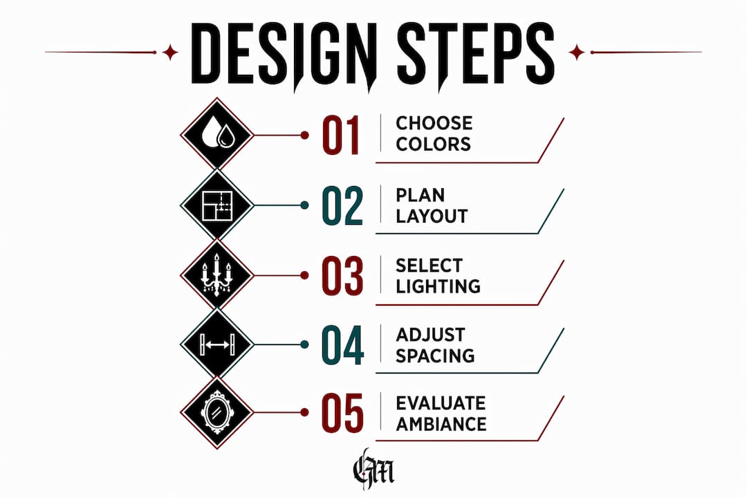
How to design the layout and color scheme for a dark gallery
Layout is the grammar of a gallery. Without consistent structure, even the strongest artwork loses impact.
Consistent frame spacing of 2–4 inches between pieces is the industry standard for professional visual flow. Tighter spacing creates density and drama. Wider spacing isolates each piece and gives it room to breathe. Both approaches work in dark galleries, but inconsistency between the two reads as careless.
Grid, salon, and linear arrangements
The grid arrangement places frames in precise rows and columns. It suits photography, prints, and works of uniform size. The result is architectural and controlled, which pairs well with dark aesthetic themes built around geometry or horror iconography.
Salon style stacks frames in organic clusters at varying heights. It works best for mixed media collections where pieces differ in size and subject. The visual density of salon hanging amplifies the immersive quality of a dark room design.
Linear arrangements hang pieces in a single horizontal line at eye level. This format is clean and modern, ideal for a minimalist dark gallery where each piece is meant to stand alone.
| Layout style | Best for | Limitation |
|---|---|---|
| Grid | Uniform prints, photography | Requires matching frame sizes |
| Salon style | Mixed media, varied sizes | Can feel chaotic without a unifying color |
| Linear | Statement pieces, minimal collections | Limited to smaller collections |
Choosing wall colors that serve the art
Dark walls in charcoal, forest green, or navy create contrast that makes artwork appear to glow. This is not a stylistic trick. Dark backgrounds reduce ambient light scatter, which forces the eye toward the illuminated artwork. The dark aesthetic emphasizes storytelling and atmosphere, using dark backgrounds as dramatic stages rather than passive surfaces.
Avoid pure black walls in physical galleries unless your lighting is exceptional. Black absorbs so much light that artwork can appear flat and underlit without a significant investment in fixtures.
Pro Tip: Forest green and deep navy read as dark without the light absorption penalty of true black. They are the most forgiving choices for home galleries with standard ceiling heights.
What lighting strategies optimize a dark gallery viewing experience?
Lighting in a dark gallery is a technical discipline, not a decorative afterthought. Gallery lighting is designed to accurately reveal the artist’s intent through high CRI bulbs and track systems. Residential lighting is designed for general visibility. The two goals are fundamentally different.
Beam angles and track placement
Beam angle determines how tightly or broadly light falls on a piece. A narrow beam (15–25 degrees) creates a spotlight effect that isolates the artwork and deepens surrounding shadows. A wide beam (40–60 degrees) distributes light more evenly but reduces drama. Most dark galleries benefit from narrow beams on individual pieces combined with low ambient fill light.
Track placement matters as much as bulb choice. Lighting beam angles and track placement determine how shadows and highlights create physical presence for dark-toned artwork. Position track heads at a 30-degree angle from the wall to minimize glare on the frame glass while still illuminating the surface of the piece.
Compensating for dark wall absorption
Dark walls naturally absorb significant light, so lighting designs need to compensate with brighter, well-placed fixtures. A charcoal or navy wall can absorb 80–90% of ambient light compared to a white wall. This means your artwork lighting must work harder to achieve the same visibility.
“Lighting is the most transformative and most underestimated tool in dark gallery design. Get the bulbs wrong and the entire atmosphere collapses.” — Banno Lighting, art gallery lighting design specialists
Practical solutions include increasing fixture wattage, adding secondary accent lights at lower positions, and using picture lights mounted directly to frames for pieces that need extra visibility.
Avoid these common lighting errors:
- Using warm-toned bulbs below 2700K, which push artwork into orange territory
- Placing track heads directly above the artwork, which creates top-down shadows that flatten texture
- Relying on a single overhead fixture for an entire wall
- Using LED strips as primary gallery lighting. They create even, flat illumination with no directional depth.
How to implement a digital dark aesthetic gallery
A digital dark gallery follows the same atmospheric principles as a physical one, but the tools are different. Charcoal or true-black backgrounds with minimal, high-contrast typography enhance focus in digital dark galleries. The background becomes the equivalent of your painted wall.
UI color and accessibility
Text and UI color choices in digital dark galleries are critical for balancing style with accessibility. Cool grays and off-whites are the correct text colors for dark backgrounds. Pure white text on pure black creates excessive contrast that causes eye strain during extended viewing. Off-white (#F5F5F5 or similar) reduces that strain while maintaining the dark aesthetic.
Neon accent colors are the most common mistake in digital dark gallery design. Neon accents in digital dark galleries cause visual fatigue and chromatic interference. A single neon element draws attention away from the artwork and toward the interface. Use muted accent colors instead: deep burgundy, slate blue, or aged gold.
Features that improve the digital experience
- Lazy loading prevents slow page loads that break the viewing experience before it starts
- Lightbox overlays let visitors expand individual pieces without leaving the gallery page
- Category filtering allows visitors to sort by style, medium, or theme, which is especially useful for large collections
- Smooth CSS transitions between gallery states reinforce the atmospheric tone without jarring cuts
| Feature | Purpose | Impact on experience |
|---|---|---|
| Lazy loading | Speeds up initial page load | Reduces abandonment before viewing |
| Lightbox | Full-screen artwork view | Increases engagement per piece |
| Category filter | Organizes large collections | Improves navigation and discovery |
| Smooth transitions | Maintains visual tone | Reinforces the dark aesthetic |
Pro Tip: Test your digital gallery on a phone screen in a dark room. If the text is hard to read or the accents feel aggressive, adjust contrast before publishing.
Common mistakes when building a moody aesthetic gallery
Every dark gallery project hits the same set of problems. Knowing them in advance saves significant rework.
- Overusing saturated or neon colors. One neon element becomes the focal point of the entire room. Use it only if the artwork itself demands it.
- Ignoring lighting technicalities. Flat, even light destroys the depth that makes dark galleries compelling. Every piece needs directional light.
- Poor color reflection management. Dark walls reflect color onto artwork borders. Matte finishes preserve artwork color integrity by limiting glare and unwanted reflections. Gloss finishes amplify the problem.
- Inconsistent frame spacing. Mixing 1-inch and 6-inch gaps on the same wall disrupts visual flow. Commit to a spacing range and measure before hanging.
- Rigid layouts that cannot adapt. Flexible curation via modular layouts enables galleries to tell evolving stories and maintain engagement over time. A gallery that cannot change becomes stale within months.
The fix for most of these problems is the same: slow down the installation process. Hang one piece, light it, and evaluate before adding the next. Dark galleries reward patience.
Key takeaways
A cohesive dark aesthetic gallery depends on three non-negotiable elements: a controlled color palette, directional high-CRI lighting, and consistent frame spacing that holds the composition together.
| Point | Details |
|---|---|
| Color palette control | Limit to 2–3 core colors plus neutrals to prevent visual fatigue. |
| Lighting is technical | Use high CRI bulbs and angled track heads to reveal artwork depth. |
| Matte finishes matter | Non-reflective wall paint prevents color cast onto artwork borders. |
| Spacing creates flow | Maintain 2–4 inches between frames for professional visual rhythm. |
| Digital galleries need contrast care | Use off-white text and avoid neon accents to protect viewer comfort. |
Why lighting is the decision most curators get wrong
I have seen beautifully chosen artwork completely disappear into a dark wall because the lighting was an afterthought. The color palette was perfect. The frames were right. But the bulbs were standard warm-white residential fixtures pointed straight down from the ceiling, and the entire gallery looked like a dim living room.
The counterintuitive truth about dark gallery design is that it requires more technical lighting precision than a white-walled gallery, not less. White walls are forgiving. They scatter light and fill in shadows automatically. Dark walls do none of that work for you.
My honest recommendation: buy your lighting before you choose your wall color. Test the bulbs against your artwork in a dark corner of the room. If the colors look accurate and the texture reads clearly, you have the right setup. Then paint the wall. Reversing that order is the most expensive mistake in dark curation.
The other thing I would tell any first-time dark gallery curator is to treat the layout as a living document. Modular design and re-hang flexibility distinguish professional galleries from static installations. Your taste will evolve. Your collection will grow. Build a system that can change with you.
— Rey
Find your next piece at Goth
Building a dark aesthetic gallery starts with finding artwork that carries genuine weight. Goth curates dark art, gothic decor, and alternative pieces from independent creators who understand the aesthetic from the inside. Every item on the platform is chosen for its visual and emotional specificity, not mass-market appeal.

Whether you are sourcing a statement canvas for a salon-style wall or hunting for dark gallery decor that holds up under directional lighting, Goth connects you with creators who make work built for spaces like yours. You can also explore the gothic art curation guide for deeper context on building a collection with intention. Visit Goth to browse the full catalog.
FAQ
What wall colors work best for a dark aesthetic gallery?
Charcoal, forest green, and navy are the most effective choices. They create contrast that makes artwork appear to glow without absorbing as much light as true black.
How far apart should frames be spaced in a dark gallery?
Industry standards recommend 2–4 inches between frames for professional visual flow. Consistent spacing is more important than the exact measurement.
What bulb type is best for lighting dark gallery walls?
High CRI bulbs rated 90 or above are the standard for gallery lighting. They render artwork colors accurately and reveal texture that lower-CRI bulbs flatten.
How do I avoid visual fatigue in a digital dark gallery?
Use off-white or cool gray text instead of pure white, and avoid neon accent colors. Neon accents cause chromatic interference that pulls attention away from the artwork.
What is the 2–3 color rule in dark gallery design?
The 2–3 color rule limits your palette to two or three core colors anchored by neutrals. It prevents the visual chaos that comes from mixing too many competing tones in a single dark space.